Every finding was tied to a decision, and the decisions were ordered so FinAut could start on Monday rather than after a re-platforming.
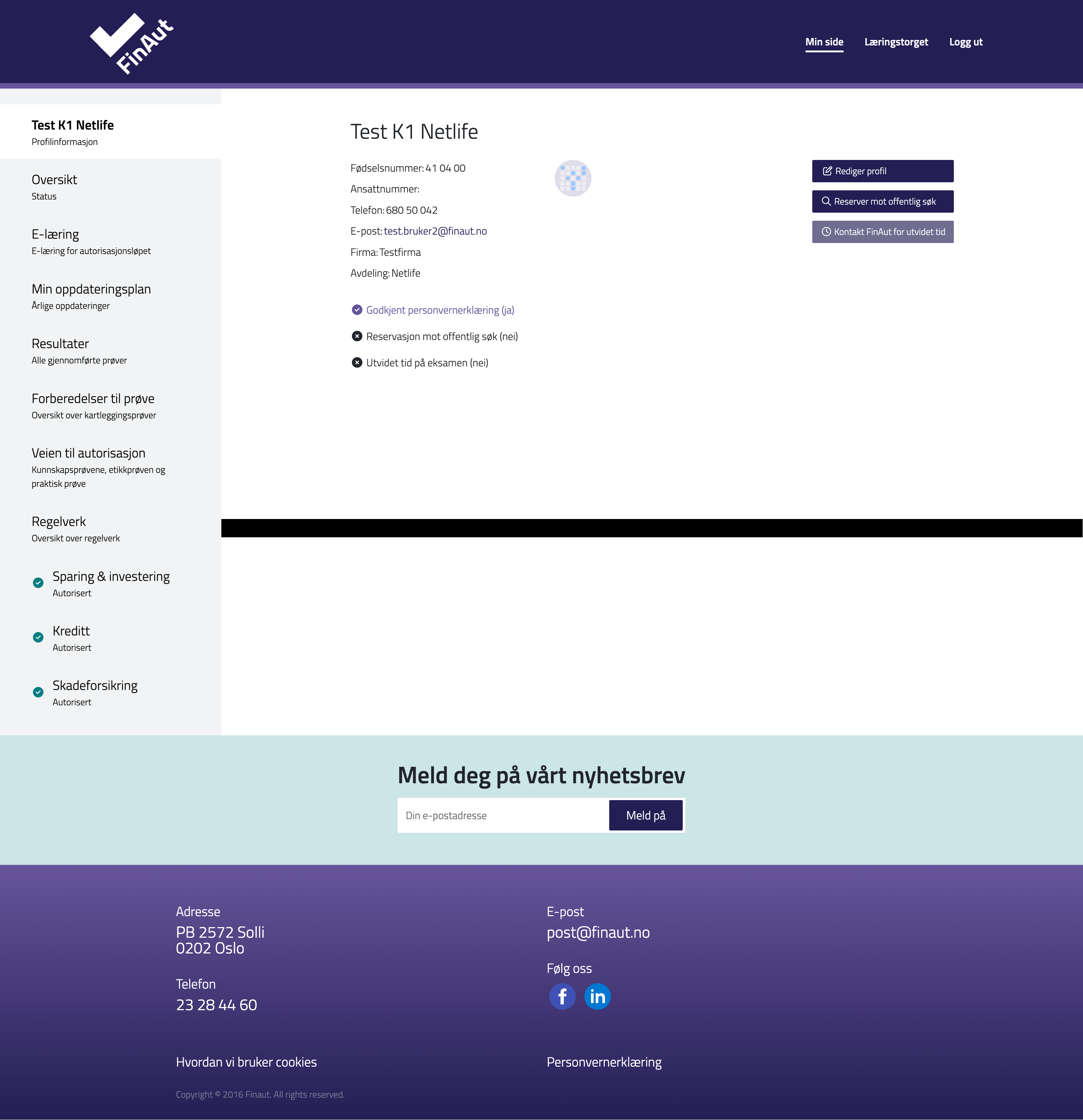
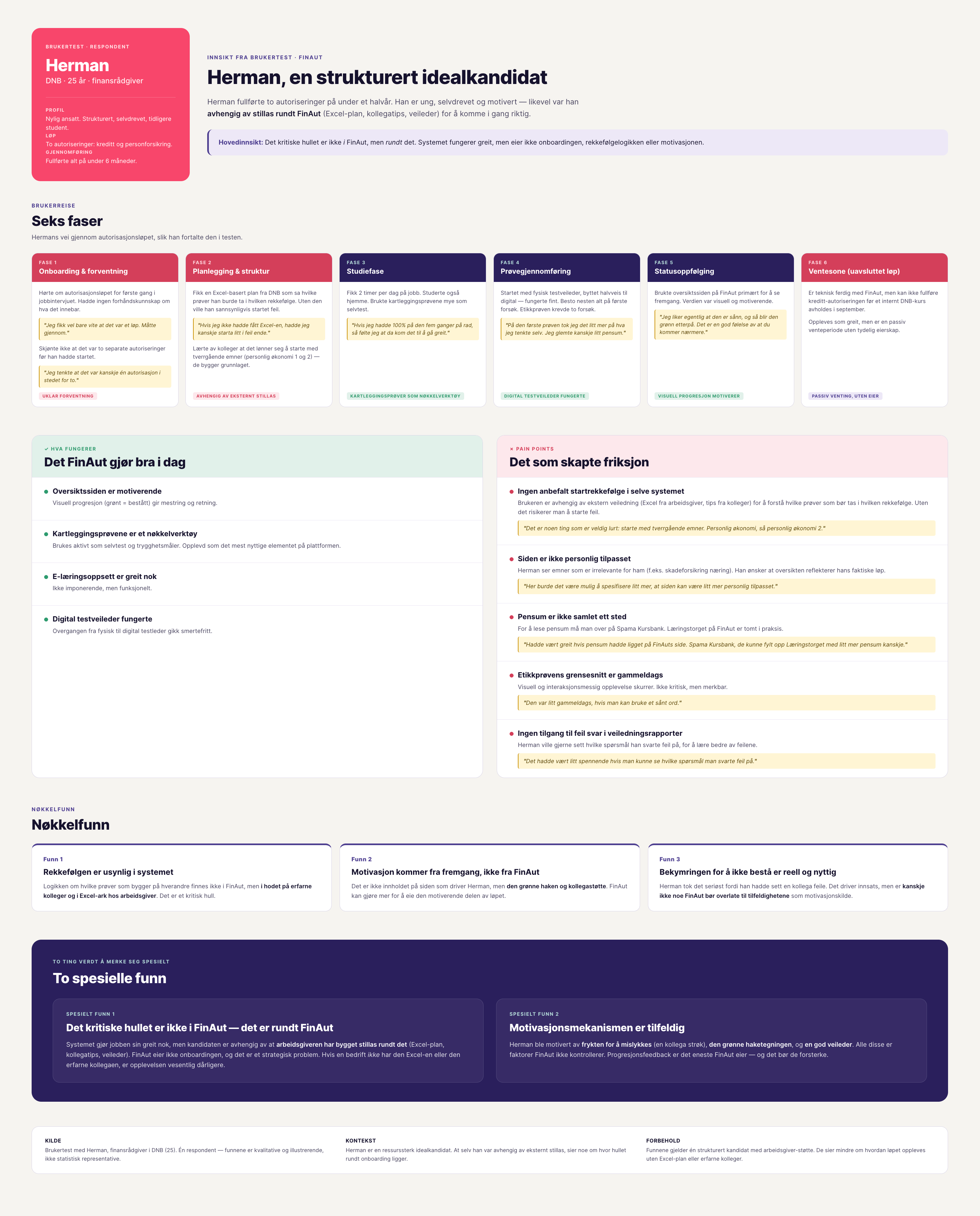
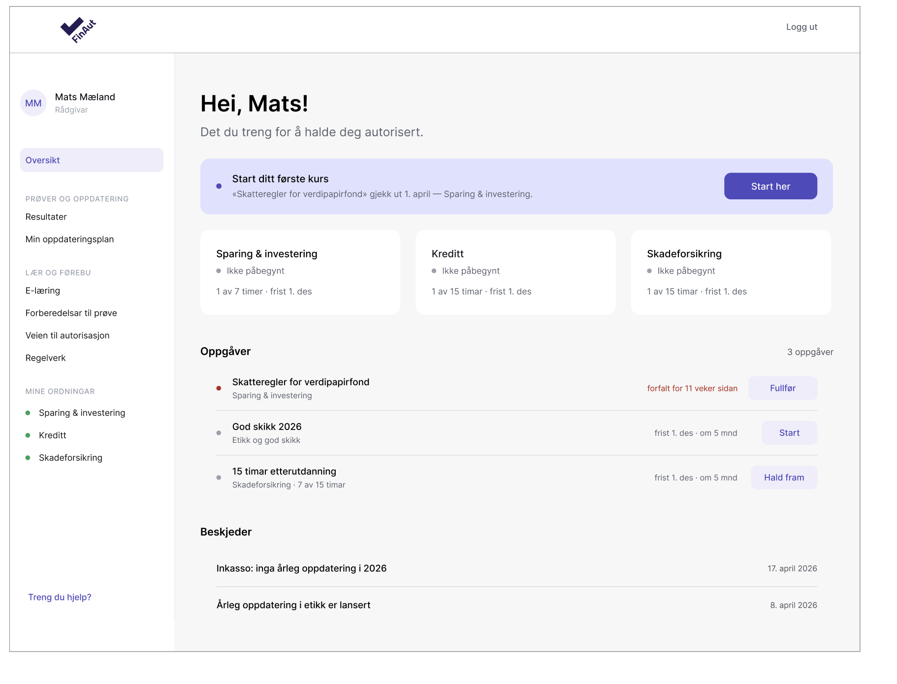
Nobody gets a status when they log in, whichever role they hold. This is where the experience collapses.
→Rebuild the start page as a status view with one clear next step, replacing today’s generic landing. Priority one.
Administrators build their own systems in Excel because the portal gives them no real-time status.
→A simple dashboard with colour-coded status per candidate, search as the primary entry, and enrolment where the data already is.
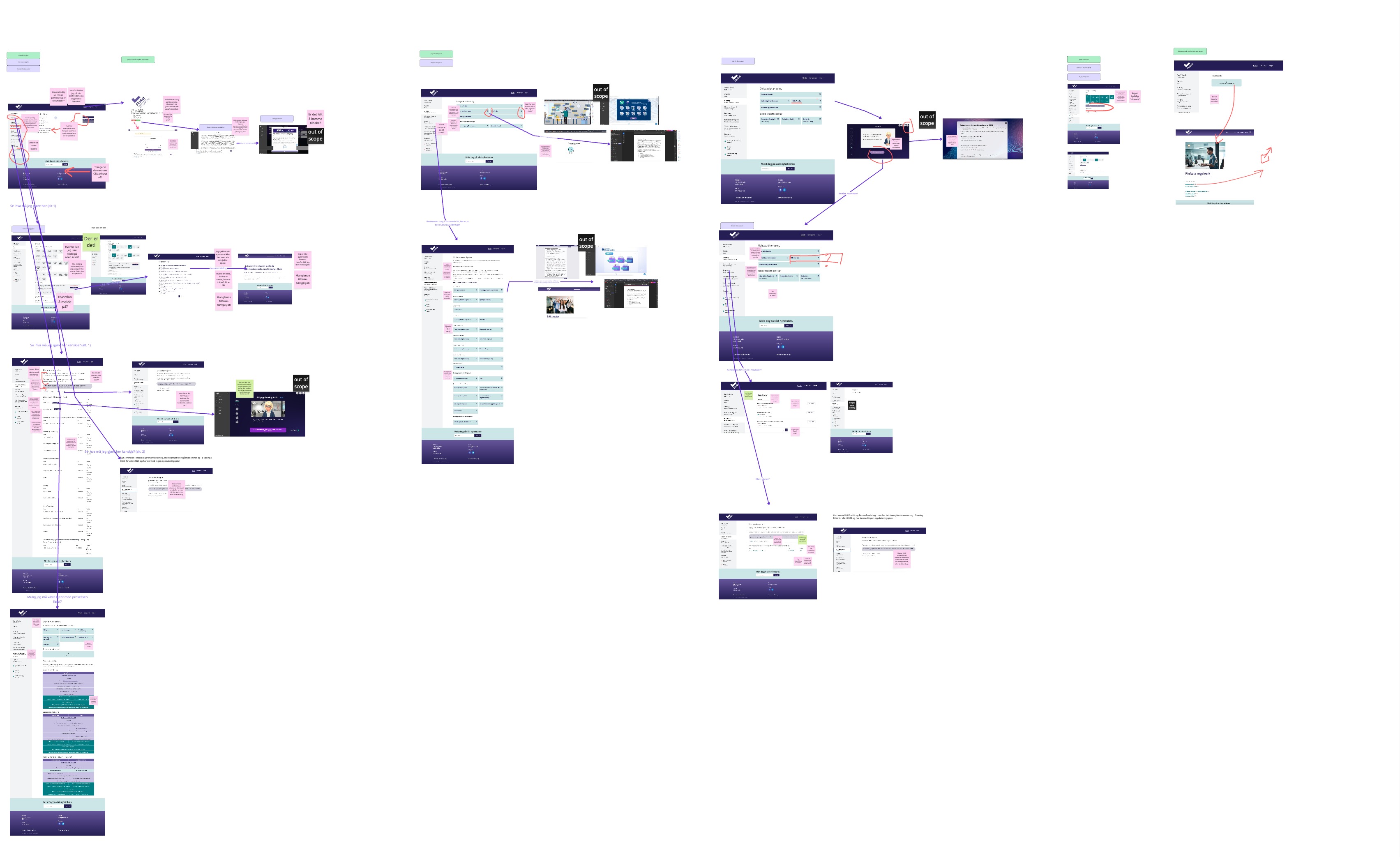
The expert evaluation found keyboard traps, contrast failures, an inaccessible embedded PDF and a possible leak of personal data.
→Fix the accessibility and GDPR breaches first: legally required whichever direction FinAut chooses.
The portal depends on a supplier’s interfaces, and replacing the supplier would be a heavy, risky project.
→Start with UX on the existing systems, and require an API from the supplier in parallel, so the fast win also builds the long-term structure.
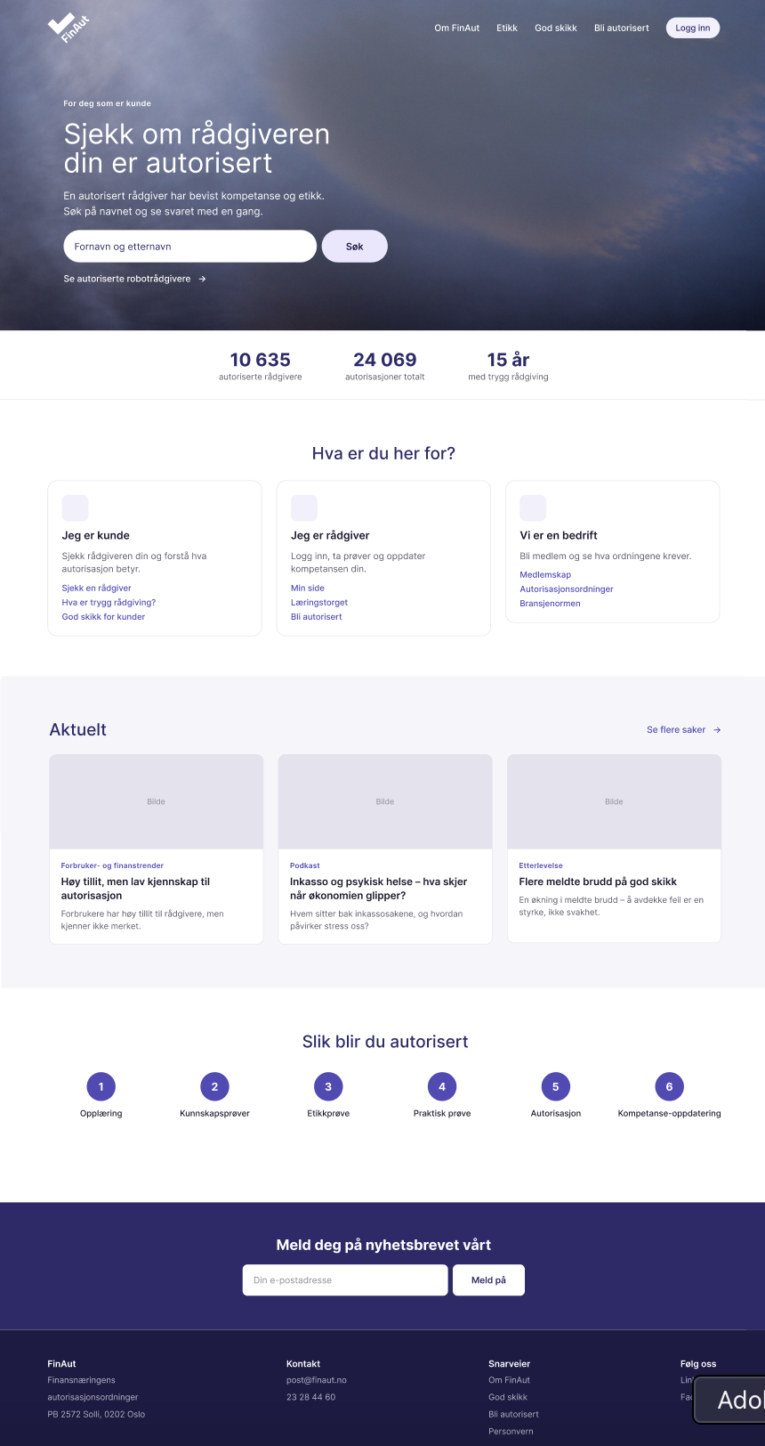
The public site and the portal are technically woven together, though they serve different audiences.
→Separate them: the site proves the scheme is real and stays editorially owned, the portal moves people through a process.
Changes have been driven by single orders, without anyone owning the whole experience.
→An internal owner of digital development, able to set requirements to suppliers with the user experience as the starting point.