Anastasia Buialo / UX- and Product Designer, Oslo
Insight and design, shaped into products people actually use.
I'm a UX designer with a background in visual communication and eight years of building digital products, from early-stage startups and scaled technology platforms to member associations and charities. I work insight-driven: hypotheses, testing, learning. Less friction, more control for the user, measurable effect for the business.
Selected work
Some of this work can't be shown publicly and some data is anonymised due to NDAs. Happy to walk through the details over a coffee.
Tiltakshåndboka is RBUP's living overview of what works in children's and youth mental health. I lead the insight and UX improvements, insight-driven and AI-assisted, for a deeply professional resource with demanding navigation across conditions, measures, tests and systematic reviews.
- Insight into how clinicians and researchers actually search
- AI-assisted findability, from a question in your own words to the right summary
- Navigation and structure for a complex professional domain
Role
Insight lead · UX improvements
In the project
FinAut runs the authorisation schemes that keep advisers in Norwegian finance qualified. The portal sits on several supplier-owned learning platforms, and nobody, candidate or administrator, gets a clear status when they log in. I led the insight work and turned it into a decision basis: one diagnosis, a recommended direction, and three priorities to start from.
- Expert evaluation, depth interviews and moderated tests with all three user groups
- Journeys mapped with the mental model method, plus a mapping of the system landscape
- Prioritised recommendations, documented accessibility and GDPR breaches, and interface concepts
Role
UX design · Insight lead
In the project
A UX lift for a vocational college growing beyond health. I raised the bar for navigation, information architecture and conversion, and designed a CMS-friendly design system the team can run, alongside a visual designer, content designer and developer.
- Information architecture organised by intent, not the org chart
- A CMS-friendly block system the team can run without a developer
- A guided journey to "meld interesse" and "søk studieplass"
Role
UX design · IA · Interaction
In the project
c)optikk is Norway's largest association of privately owned optician stores. To make their members' expertise in eye health visible, they launched a new certification brand and the website optikerklinikk.no. Netlife delivered the name, brand, identity, content and design; I owned the UX.
- Evaluated the existing concept and designed the new site on the new visual identity
- Anchored design decisions in insight from user testing
- Contributed sketches and direction for the visual language
Role
UX design · Concept development
In the project
Otovo is a marketplace for residential solar, organising hundreds of vetted local installers. I led Solar Planner, a new self-checkout purchase flow, validating whether customers ready to commit could buy faster on their own.
- Discovery through user and stakeholder interviews, archetypes and journey mapping
- Low-to-mid fidelity wireframes, tested and iterated through remote interviews and metrics
- The pilot showed self-checkout works when assisted: the customer stays in charge, a sales agent monitors and steps in on questions
+40%
conversion for customers who started self-checkout
In the project
Roles
- Netlife, UX- and Product Designer · 2025 –
- Otovo, UX Designer · 2020–25
- Correlate, UX Designer · 2018–20
- Norwegian Refugee Council, Graphic Designer · 2018–19
- Indexo, UX Designer · 2018
Education
- BA Visual Communication, Polish-Japanese Academy of IT, Warsaw · 2014–17
- BA Media Communication, Taras Shevchenko University, Kyiv · 2010–14
Certifications
- Claude Code in practice, Anthropic · 2026
- Vibe coding with AI, Oschlo · 2025
- Product Discovery Certification, Mind the Product · 2025
- Prototyping in Figma, Designlab · 2025
- Mobile UX Design, Interaction Design Foundation · 2023
- UX research programme, University of Michigan (Coursera) · 2020
Recognition
- UX Nordic Award finalist, Otovo Solar Planner · 2023
- Shorthand Award, best non-profit story, NRC · 2019
Languages
- English · Norwegian · Ukrainian · Polish
I start from a hypothesis and what would have to be true for it to hold.
From there, I test early with the people who'll actually use it and let what they show me steer the work, not gut feeling. I'd rather learn cheaply from a rough prototype than polish the wrong thing.
Design
Interaction design·Concept development·Wireframing & prototyping·UI design·Design systems·Form design·Visual identity & graphic design
Research & insight
User testing·User interviews·Journey & service mapping·Card sorting·A/B & hypothesis testing·Analytics and metrics·Insight reporting
Tools & AI
Figma, FigJam·Hotjar·Google Analytics·Lyssna·Notion·Adobe Illustrator, Photoshop·Vibe coding with AI·AI-assisted prototyping·AI-assisted research synthesis·Designing AI-driven features·Shipping to git via the terminal & the Claude–Figma bridge
Ways of working
Cross-functional collaboration·Stakeholder communication·Workshop facilitation·Design ops·Curiosity·Student and trainee mentorship·Working across markets & cultures
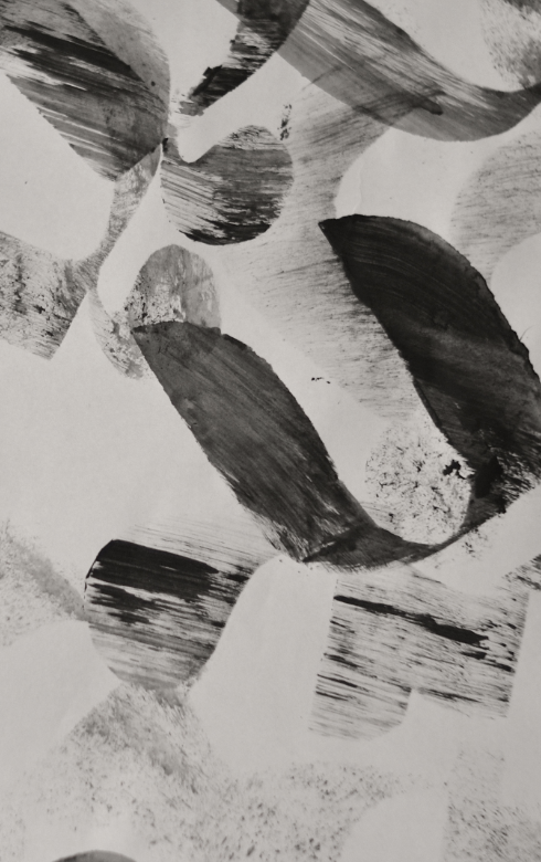
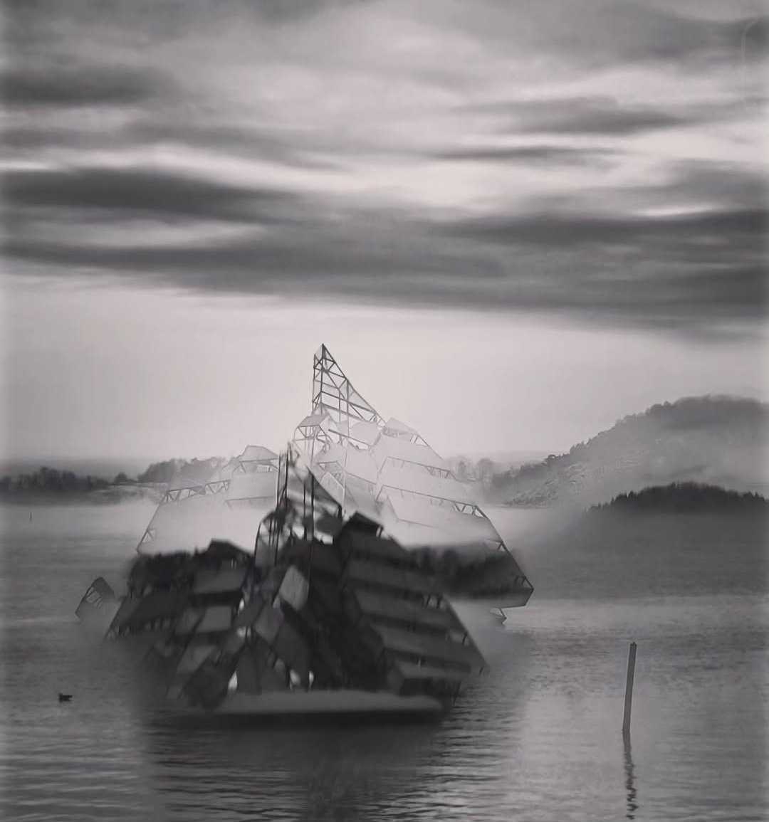
My roots are in clean, disciplined design. During my studies I was drawn most to modernism, De Stijl and a bit of wabi-sabi. These days I like to mess around too, on screen and by hand: found objects, handmade marks, and the odd happy accident.
A display font that began as paper: letterforms cut freehand with scissors, no sketches, then scanned, traced and built into a working typeface. Every jag and overshoot is a knife decision kept, not an error removed.
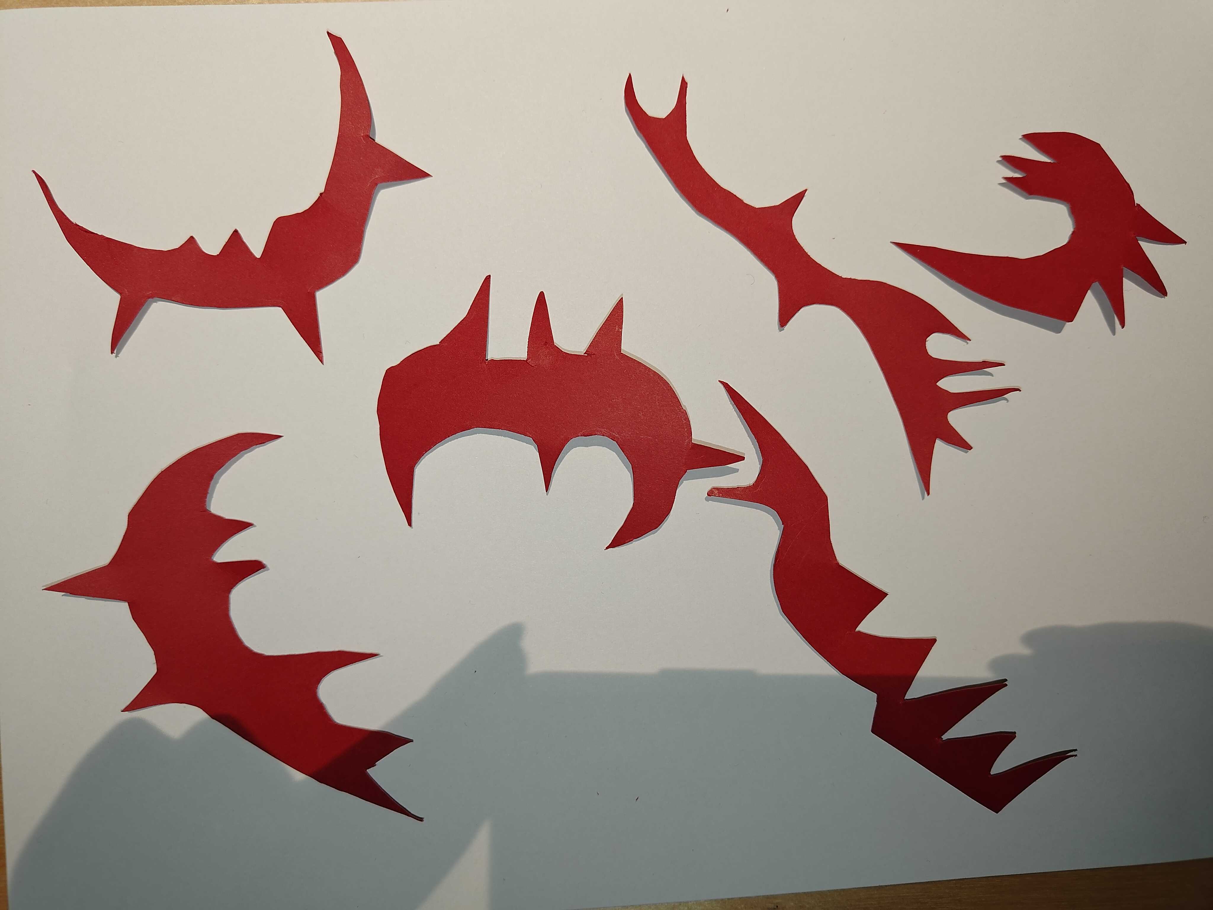
1 Arrange – shapes become letters
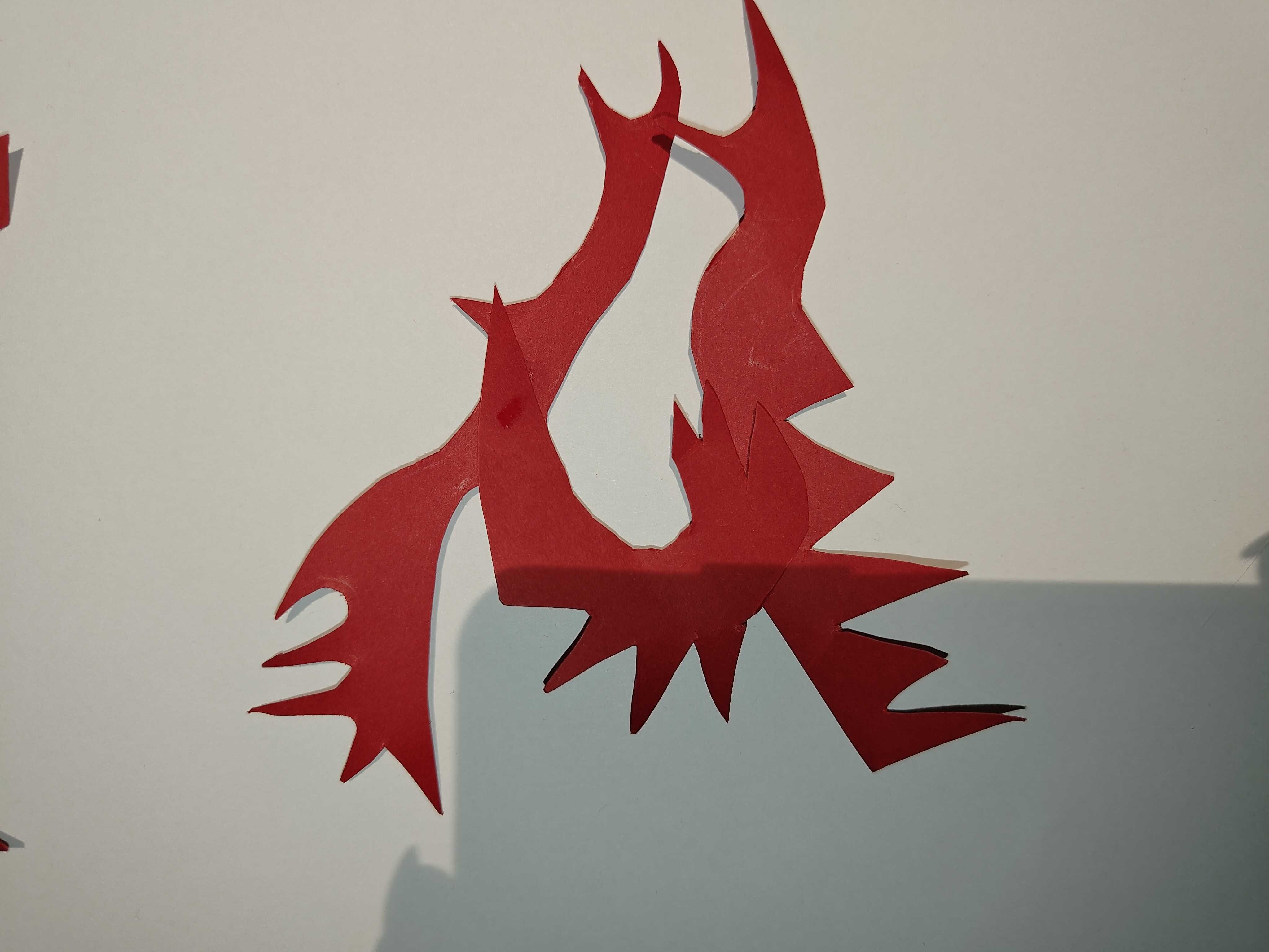
2 Cut – freehand, no sketches
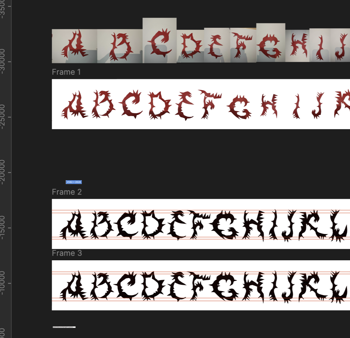
3 Scan, trace & refine – errors kept, on a baseline grid in Figma
4 The working OTF – set live
References
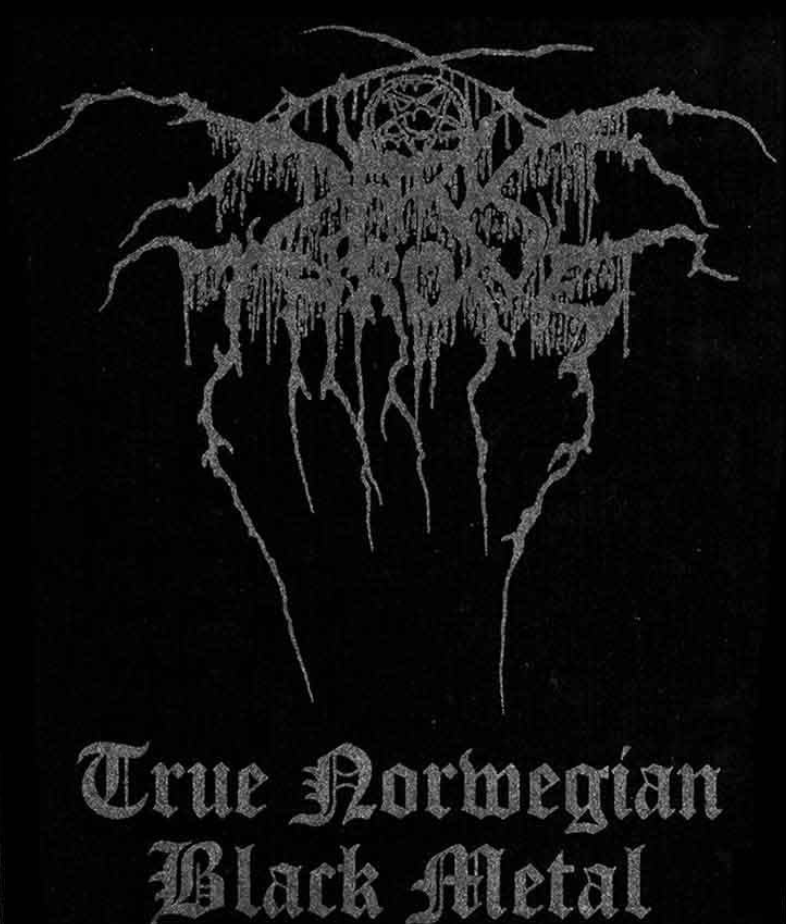
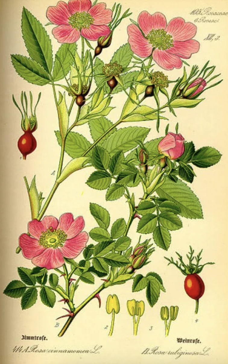
Two references met in the middle: Norwegian black-metal lettering (hand-drawn, symmetrical, dissolving into branches) and 19th-century botanical plates, where every thorn is documented with care. Thornskull is the overlap.
Identity and visual language for a rave collective. The wordmark starts as sharpie letters drawn by the collective’s founder, traced and run through fingerprint moirés, scanner noise and channel-split glitches, an identity built to degrade on purpose, loud where the grid is quiet.
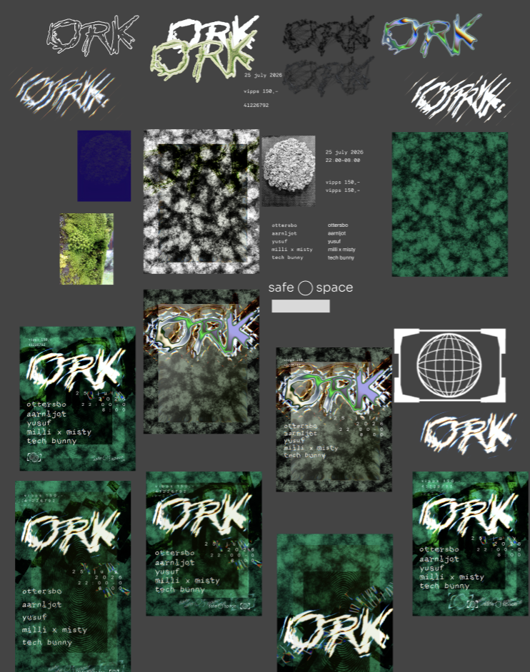
1 Explore – wordmark states and poster system
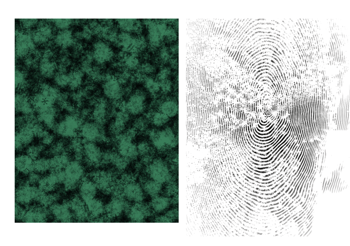
2 Texture – forest moss and an open-source fingerprint moiré
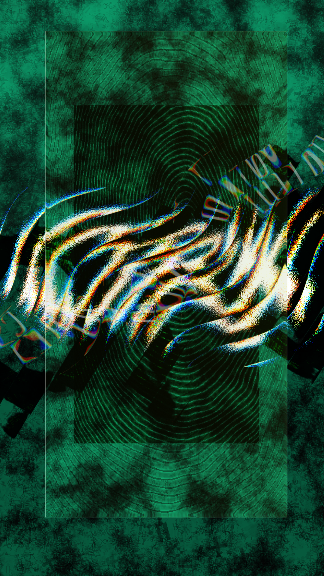
3 Degrade – scanner noise and channel-split glitches
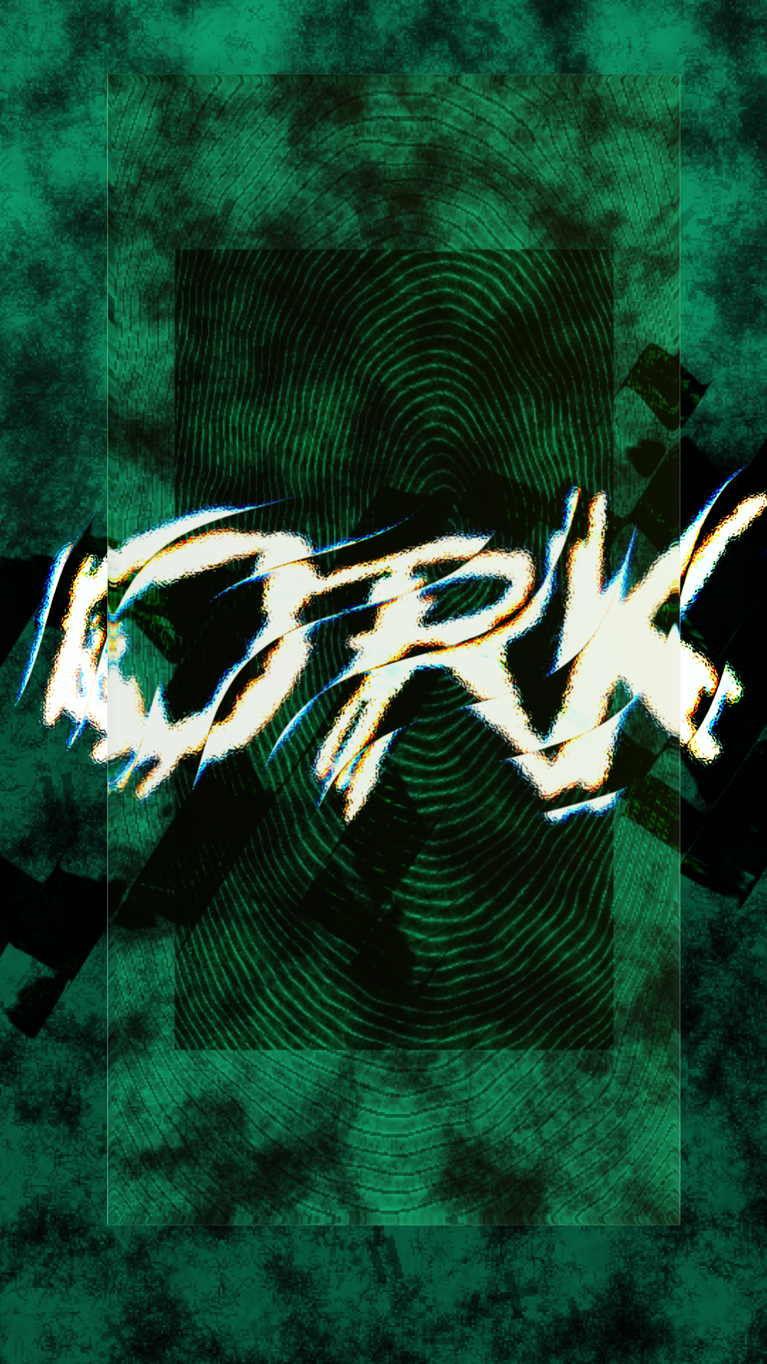
4 The wordmark – never the same twice
References
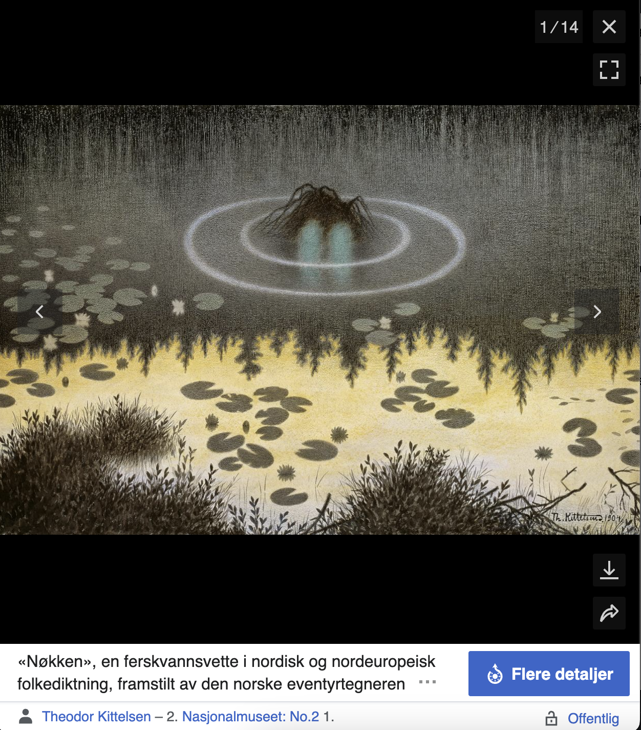
Theodor Kittelsen’s Nøkken (the creature surfacing from dark water) set the mood: Nordic folklore mystery, rendered in club-poster language.
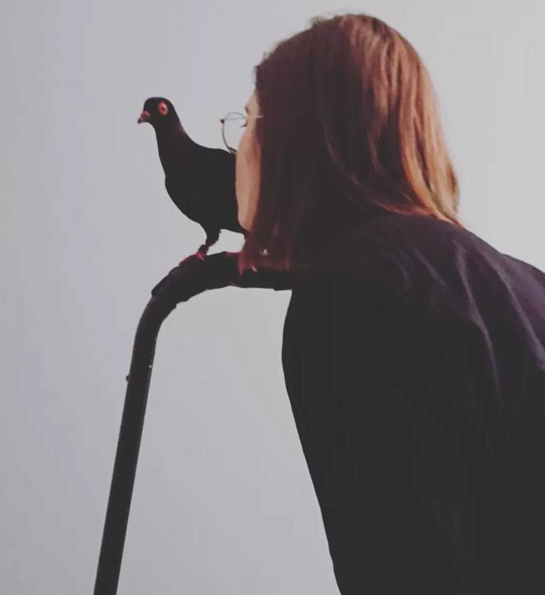
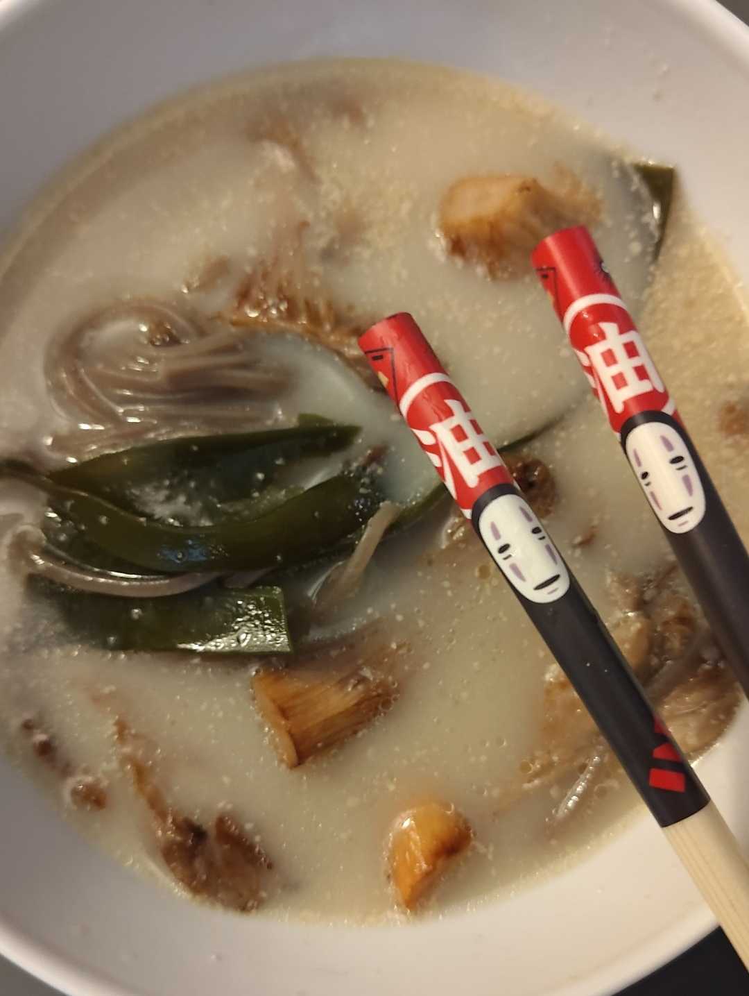
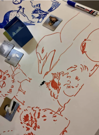
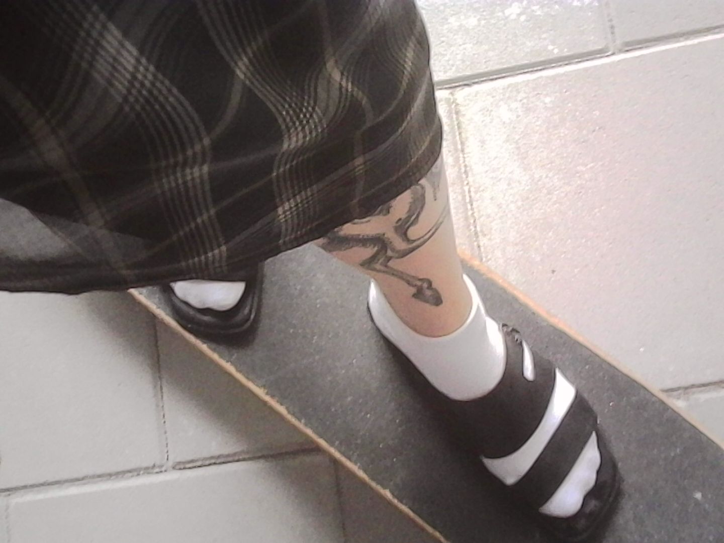
Outside work I draw, style people and rehabilitate injured birds. Much of this work happens outside invoices: pro bono, or bartered with emerging artists working for a non-profit cause. I also enjoy nature, new music, documentaries, and homemade ramen.
About
What I do best is gather insight and make complicated things simpler. I talk to users and stakeholders often, so I learn quickly and can change course when the evidence points elsewhere. I back decisions with data and what users actually say, and I build rough prototypes early, because it is smarter to learn than to polish the wrong thing.
I've lived in three countries and explored many more. I speak English, Ukrainian, Norwegian and Polish, and I'm used to working with diverse cultures. Outside client work, I do pro bono design for causes I care about and volunteer for FugleAdvokatene, rehabilitating injured birds.
Got a project, need a design sounding board, or just want to spar? Get in touch.