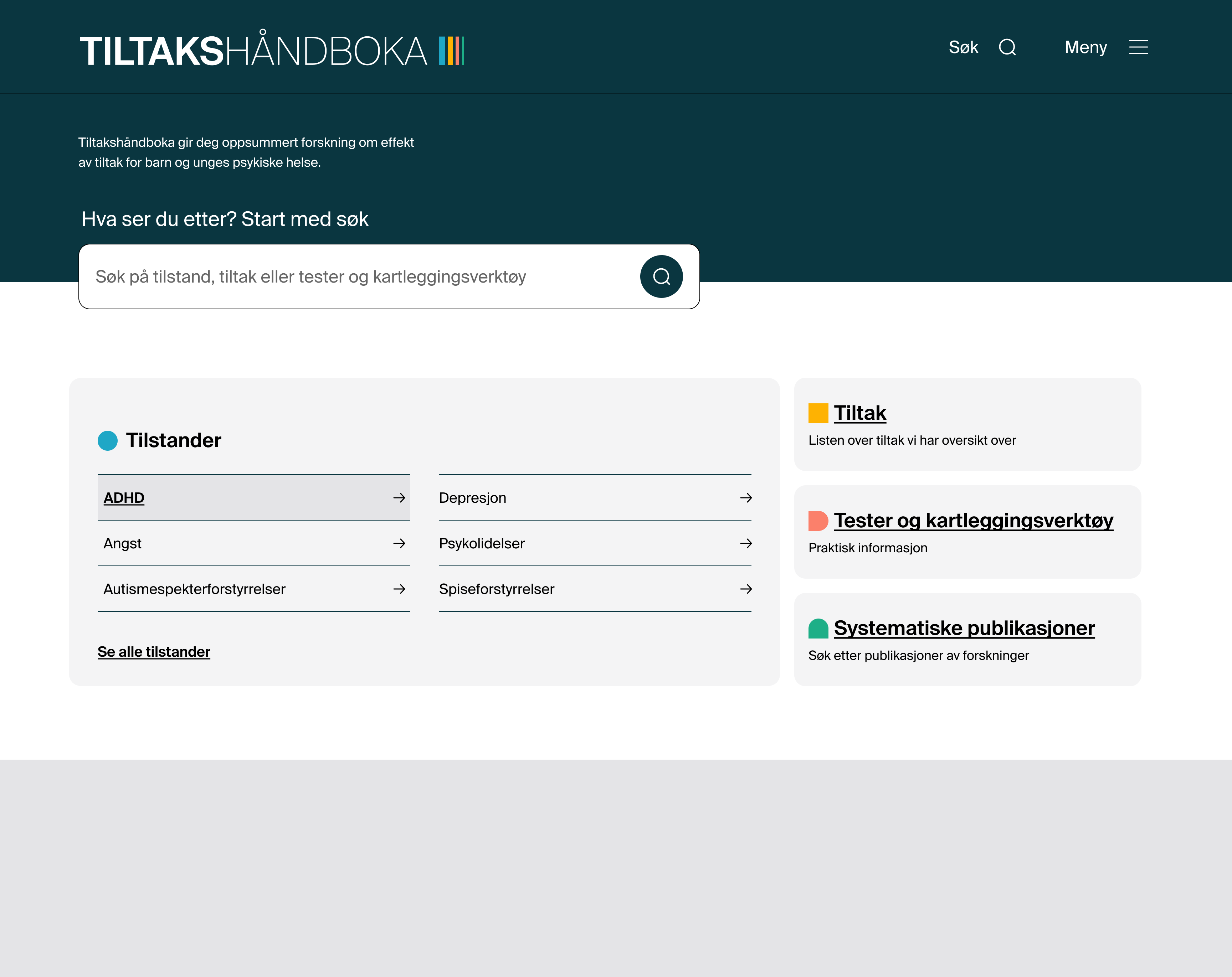
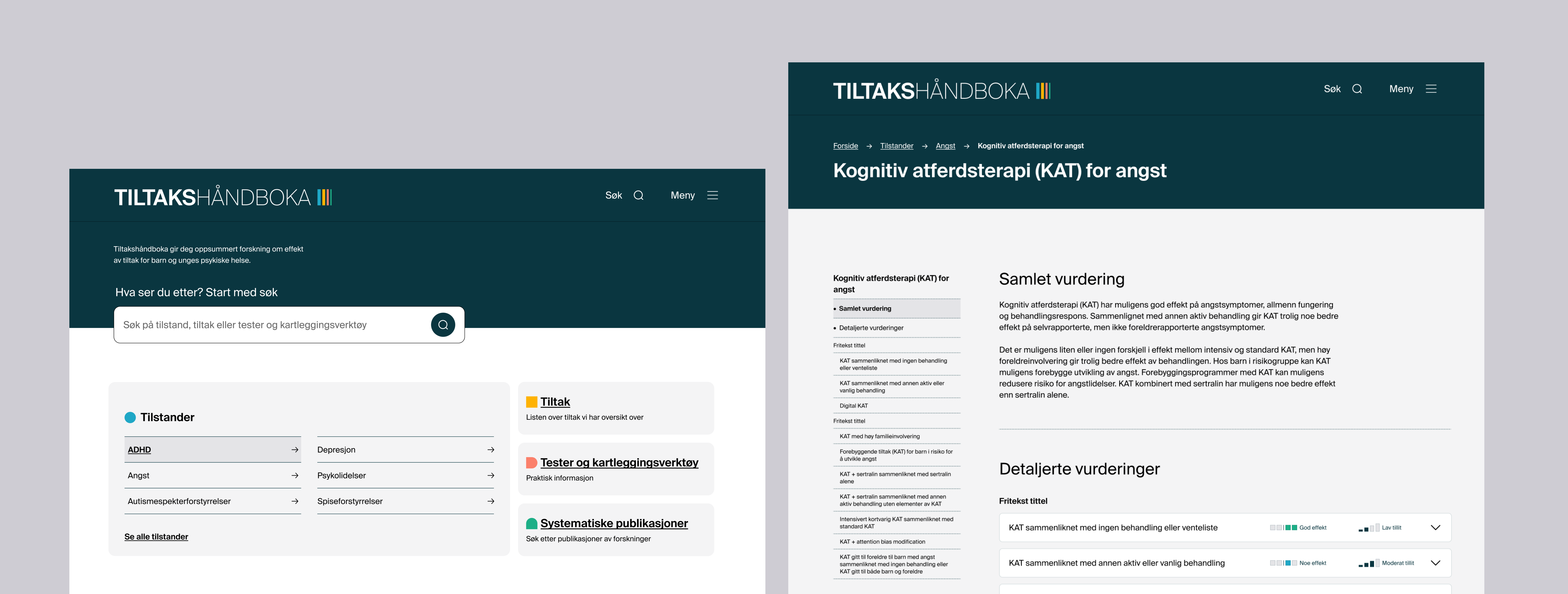
Each decision is tied back to a finding, so the team can see the reason behind it.
Search returned nothing on a typo, a synonym or two conditions at once.
→A forgiving search: tolerant of spelling and synonyms, able to handle combined terms, with live, visible feedback so people can see the results update.
People work with comorbidity, but could only view one condition at a time.
→Treat two conditions at once: let people compare, and surface shared measures, instead of hiding "concurrent conditions" at the bottom of a page.
"Systematic reviews" did not tell people what was behind the link.
→Label sections in the audience's own words, tested with real users, with plain explanatory subtext rather than domain jargon.
Links, panels and filters were missed because they did not look interactive.
→Give interactive elements clear affordances, so a professional never has to guess what is clickable.
Effect and confidence together read as a contradiction.
→Code effect and confidence more clearly, and explain in plain language what "limited research" means in practice.
Everyone entered by condition, yet the measures page was built as a primary route.
→Promote condition as the main way in, and add a condition filter to the measures page for people who start there.